

Introduction
Crafting visually striking images isn’t only about the subject or composition, but mastering color plays an integral part too. As an important facet of photography, understanding and skillfully utilizing colors can significantly elevate your photographs.
Our invaluable guide about “Color in Photography” explores seven essential techniques to help you make dynamic use of color in your photography, enhancing each shot’s emotive ability and aesthetic appeal. Ready for a vibrant journey? Let’s dive into the colorful world of photography!
Key Takeaways
- Understanding color theory is crucial for creating visually impactful photographs that evoke emotion and depth.
- The color wheel is a powerful tool that helps photographers find contrasting and complementary colors effectively, enhancing the impact of their images.
- Mastering the use of warm and cool colors can create striking contrasts and guide viewers’ attention within a photograph.
- Colors can be used strategically to evoke specific emotions in photography, and post – production editing allows for further enhancement of colors.
Technique 1: Understanding Color Theory
Delving into color theory is much like taking a deep dive into a vibrant, visual language. It’s an intriguing intersection of art and science that unveils the hidden meanings behind colors and how we perceive them.
Understanding color theory, in essence, equips you with the power to create photographs that are visually impactful and brimming with emotional depth.
In photography, color theory manifests itself in two key ways: additive color theory and subtractive color theory. The former homes in on how hues interact when light is added – think Digital images or screens where colors get brighter as more light is projected onto them.Conversely, subtractive color theory reveals what happens when certain wavelengths of light are either absorbed or reflected—a concept most commonly associated with traditional printing processes.
Through these theories, you begin to unravel the complexities of using “Color in Photography”. Harnessing this knowledge can significantly enhance your capacity for creating compelling compositions—images that make viewers stop mid-scroll on their feeds due to their undeniable allure!
Technique 2: Utilizing the Color Wheel in Photography
Diving deep into the world of color in photography, we encounter a powerful tool called the color wheel. This circular diagram of colors provides a visual representation of how hues relate to each other, serving as an essential guide for photographers seeking harmonious compositions.
The major benefit lies within its ability to help find contrasting and complementary colors effectively.
The cornerstone of using the color wheel in photography is understanding its composition. Primary colors like red, blue and yellow are equidistant on the wheel while their secondary counterparts – green, orange and purple – fill up spaces between them.
Photographers utilize this arrangement to make informed decisions about juxtapositions that can dramatically enhance an image’s impact.
A practical application includes creating striking contrasts by pairing opposite ends from the spectrum: warm hues against cool ones or bright tones with more subdued shades. Similarly, choosing adjacent hues on the wheel offer monochromatic images with subtle variations in tone and saturation levels.
Harnessing this knowledge translates into conscious decisions about color schemes which strengthen your photographs’ overall composition. It’s clear then; utilizing the color wheel plays a significant role for those wishing to masterfully inject captivating use of colors into their work.
Technique 3: Mastering Warm and Cool Colors
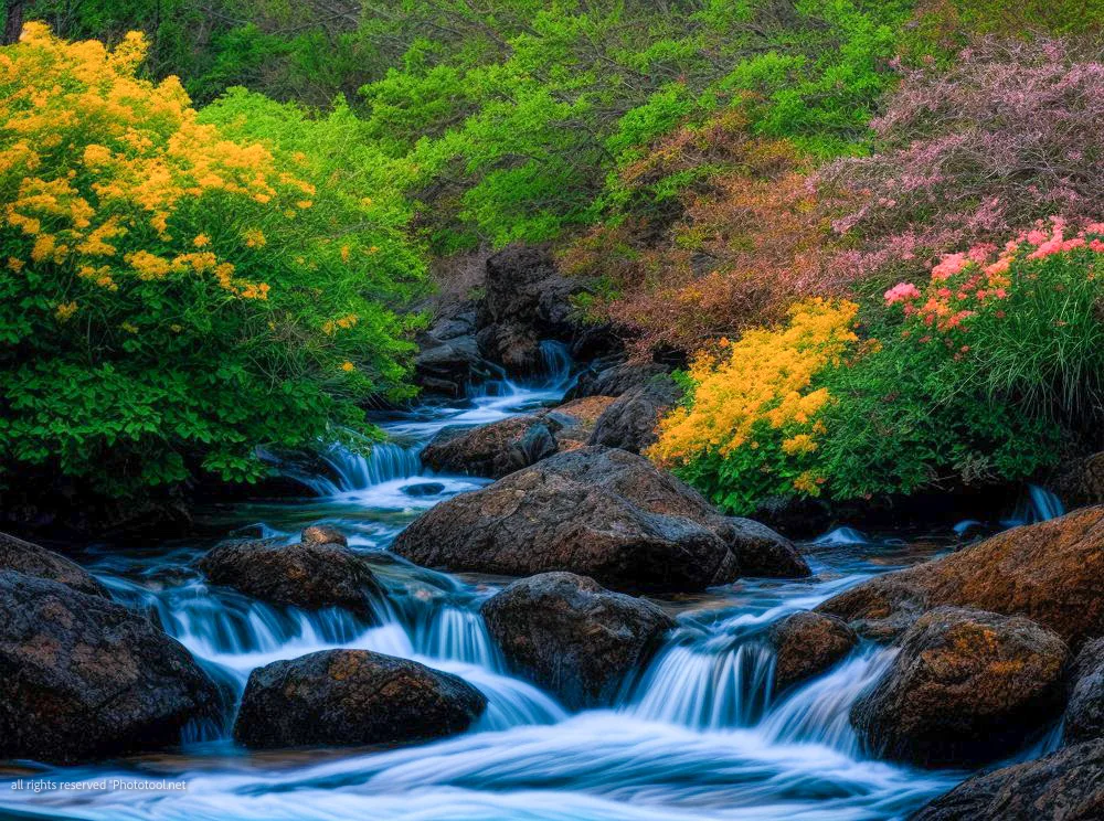
Understanding and mastering the use of warm and cool colors in photography can dramatically enhance your captures. Warm colors such as red, orange, and yellow are dominant forces that demand attention first in a photograph while cool tones like green, blue, and violet contrast starkly with them.
Playing around with these opposing color groups can help create striking contrasts and depth within photos. For instance, an autumnal landscape shot might be dominated by warm hues but adding a touch of blue sky or a teal river will make the photo pop even more! Additionally, using warm or cool colors strategically guides viewers’ eyes to important parts of the composition effectively.
So don’t shy away from experimenting with warm and cool colors in photography for stunning results!
Technique 4: Using Color to Evoke Emotion
Color plays a powerful role in evoking emotions in photography. By understanding the psychology of color, photographers can use different hues to create specific feelings and moods within their images.
For example, warm colors like red and orange can evoke excitement, passion, or even anger, while cool colors like blue and green can convey calmness, tranquility, or sadness. The choice of color scheme is crucial when attempting to elicit a particular emotional response from viewers.
Incorporating color strategically into your composition can also enhance the impact of your photographs. Experiment with using contrasting colors to create visual interest and draw attention to specific subjects or elements in your image.
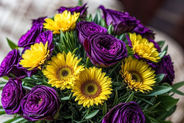
Additionally, consider how complementary colors (those opposite each other on the color wheel) can create harmony and balance within your photograph.
Post-production techniques also play a significant role in enhancing colors in photography. With editing software tools such as saturation adjustments and selective coloring, photographers have greater control over the intensity and vibrancy of their images’ hues.
Overall, understanding how to effectively use color as a tool for conveying emotion in photography allows you to add depth and meaning to your work. Experimenting with different techniques will help you develop your own unique style while creating compelling visuals that resonate with viewers.
Technique 5: Experimenting with Color Composition
Experimenting with color composition is a crucial technique for taking your photography to the next level. Understanding how colors interact and harmonize can greatly enhance the visual impact of your images.
By utilizing the principles of color theory, you can create photographs that captivate viewers and convey specific emotions.
The color wheel serves as a valuable tool for photographers looking to experiment with different color compositions. It allows you to identify complementary colors, which are located opposite each other on the wheel, creating a striking contrast in your photographs.
Playing with these contrasting colors can add depth and visual interest to your images.
Color composition goes beyond simply using contrasting colors; it involves arranging those colors in a way that strengthens the overall message or story behind your photograph. An effective use of color composition can evoke certain moods or emotions in viewers, making them feel more connected to your work.
Experimenting with different combinations of warm and cool colors, for example, can elicit feelings of warmth or serenity.
Take advantage of post-production editing tools to further enhance the colors in your photographs. Adjusting saturation levels or selectively boosting certain hues can make your images truly pop.
However, it’s important not to overdo it – subtle enhancements often yield better results than heavy-handed edits.
By experimenting with color composition techniques and understanding how different hues interact with one another, you’ll be able to create visually stunning photographs that engage and captivate viewers.
Technique 6: Enhancing Colors in Post-Production
Enhancing colors in post-production is a crucial technique that can take your photography to the next level. With advancements in editing software, you have the power to bring out the true vibrancy and richness of colors in your images.
Whether it’s intensifying the natural hues or adding a touch of creativity with selective color adjustments, post-processing allows you to create stunning visual effects.
By fine-tuning color saturation, contrast, and tone curves, you can enhance the overall impact of your photographs. For example, boosting warm tones like reds and oranges can evoke feelings of warmth and energy in landscapes or portraits.
On the other hand, adjusting cool tones such as blues and greens can add a sense of tranquility or depth to your images.

Experimenting with different color enhancements also gives you the opportunity to emphasize specific elements within a photo. By selectively enhancing certain colors while desaturating others, you can create striking contrasts that instantly draw viewers’ attention.
This technique works particularly well when photographing products or still life subjects as it can make them pop off the screen or page.
Remember that while enhancing colors in post-production is an effective way to elevate your photography, moderation is key. It’s important not to overdo it by saturating colors too much or making them appear unnatural.
Finding balance will ensure that your photos look visually pleasing while still maintaining their authenticity.
So don’t be afraid to experiment with color enhancement during post-production—explore various techniques and let your creativity shine through! The possibilities are endless when it comes to using vibrant hues strategically to create captivating photographs that tell powerful stories.
Technique 7: Practicing with Different Color Schemes
One of the essential techniques for using color in photography is practicing with different color schemes. Different color schemes, such as monochromatic, analogous, complementary, split complementary, triadic, square, and rectangle (or tetradic), offer photographers a wide range of options to create visually appealing and compelling images.
By experimenting with different color schemes in your photography practice, you can discover unique combinations that bring out the best in your subjects. For example, using a monochromatic scheme where you stick to variations of a single hue can result in a harmonious and calming effect.
On the other hand, utilizing an analogous scheme where you choose colors next to each other on the color wheel can add depth and interest to your composition.
Understanding how different colors interact and complement each other is crucial when practicing with various color schemes. Not only does it allow you to achieve balance and harmony within your photographs, but it also helps convey specific emotions or moods through the use of color.
Overall, by actively exploring different color schemes in your photography journey, you’ll develop a deeper understanding of how colors work together and become more adept at creating stunning imagery that captivates viewers’ attention.
So don’t be afraid to experiment and push boundaries – let your creativity shine through by embracing the power of different color schemes in your photography practice!
Conclusion
In conclusion, mastering the art of using color in photography can take your images from ordinary to extraordinary. By understanding color theory, utilizing the color wheel, and experimenting with different color schemes, you can create stunning visual compositions that evoke emotion and captivate your audience.
Don’t be afraid to enhance colors in post-production or play with warm and cool tones to add depth and interest to your photos. With these essential techniques at your disposal, let your creativity soar and paint the world through the lens of your camera.
Happy shooting!
FAQs
1. How can I use color effectively in my photography?
Using color effectively in photography involves understanding color theory, experimenting with different color schemes, and using colors to create visual impact or convey emotions and moods in your images.
2. What is the role of color temperature in photography?
Color temperature refers to the warmth or coolness of light sources and how it affects the colors captured in a photograph. Understanding color temperature helps photographers control White Balance and achieve accurate colors in their images.3. How can I create contrast using color in my photos?
Creating contrast using color involves pairing complementary or contrasting colors together to make certain elements stand out or evoke a sense of drama. This can be done through careful composition, subject selection, or post-processing techniques.
4. Are there any rules for using color in photography?
While there are no strict rules when it comes to using color in photography, it’s important to consider factors such as harmony, balance, and the emotional impact you want your images to have on viewers. Experimentation and personal creativity play key roles when choosing and applying colors within your photographs.